Beautiful Water-Themed Graphic Design
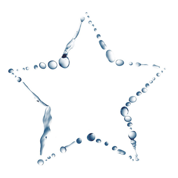
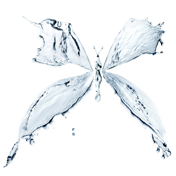
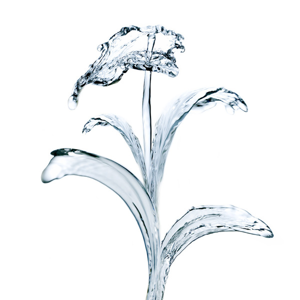
Alexandra Zaharova & Ilya Plotnikov – Splashes
This great design project constructs various objects out of water splashes. This effect is actually very difficult to do well, and so I have the upmost respect for these artists: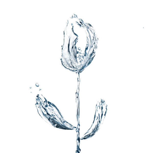

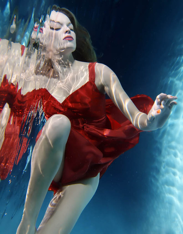
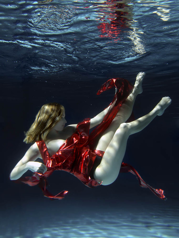
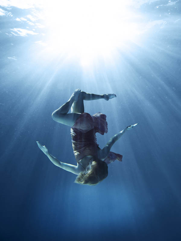
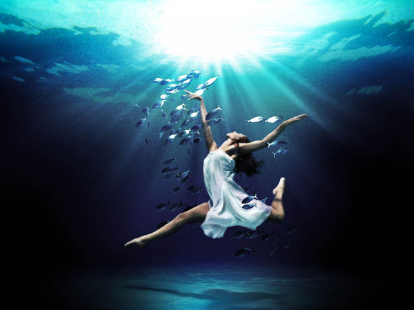
Mark Mawson – Underwater Dance
I love this photography project. The lighting and color of these photos is really impactful. The floating figures accentuate the fluidity of water, and create an atmosphere that appears devoid of any kind of gravity: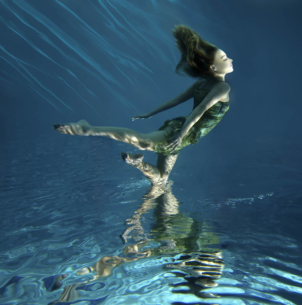
Wojciech Pijecki – Rites of Water
This is one of my favorite ever typography projects. The attention to detail is stunning, and I love how the artist has so accurately captured the texture of water.
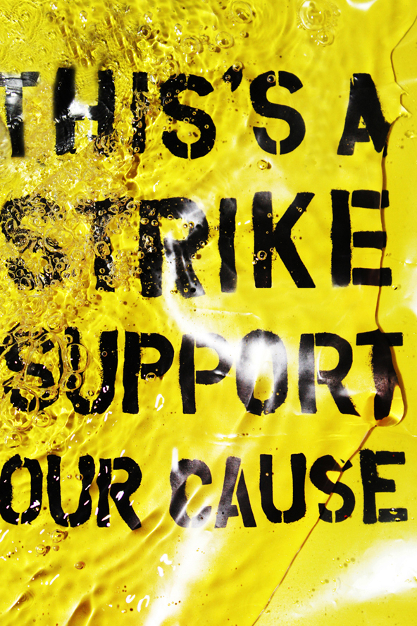
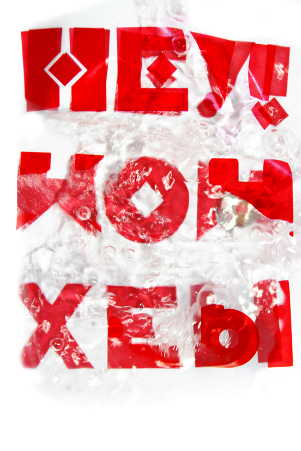
YouWorkForThem – Typography in Water
This project is really interesting. The artist takes some fairly basic typography, and then photographs water lapping over it. This adds so much to the typography, really giving it extra depth and detail: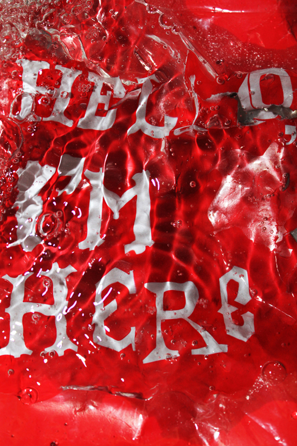
Peter Jaworowski – Barcardi Shoot & Fly
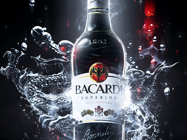
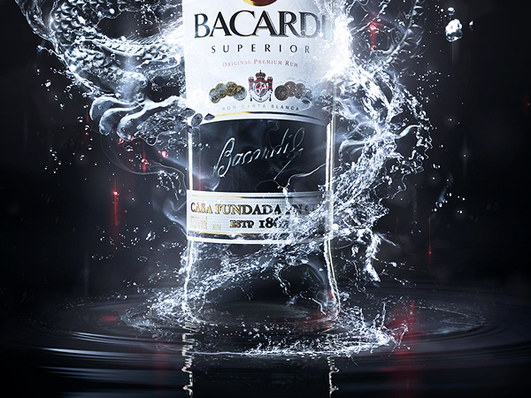
This is a great example of water being used in product advertising. This really shows how water can be manipulated. The artist has artfully wrapped the streams of water around the centrally positioned product, and even manipulated it to form the shape of a dragon: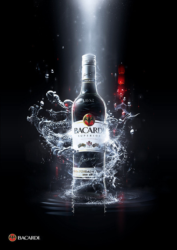
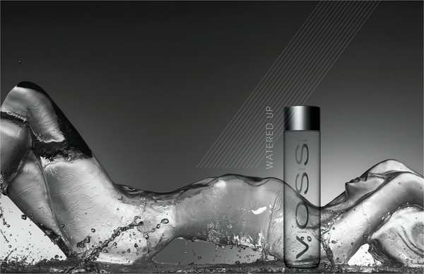
Joseph Tremblay – VOSS
Like with the Barcardi advert, I love how the artist has manipulated water so artfully. He has moulded various photos of water perfectly to form the shape of a woman, and given added emphasis to his piece by including extra splashes of water: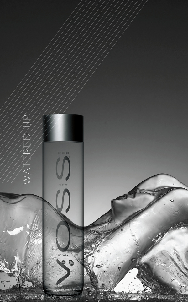


Comments
Post a Comment